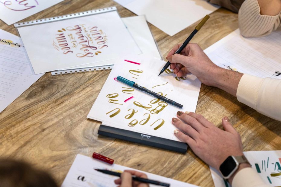
Begin your calligraphy journey by learning the fundamental strokes first, rather than jumping straight into forming complete letters. This simple shift can instantly demystify the process. A fresh, blank page can feel intimidating if you don’t know what to fill it with. By dedicating a few moments to drawing simple upstrokes, thick downstrokes, circles, circles with tails, tail loops and entry and exit strokes, you’re setting yourself up for success before moving on to words! It’s not about making pretty strokes; it’s about understanding how those tiny shapes combine to form the words that you will write.
If your pen is moving with pressure, your strokes will become thinner than if your pen is pressed harder into the paper. Upstrokes (where the pen is traveling upward) should naturally be lighter than downstrokes (where the pen is pressing downward) because they’re less likely to press hard on the paper and downstrokes are naturally heavier as you have the added benefit of pushing harder down on the paper. You don’t want them to all look the same, or it will start to feel unnatural. And don’t forget not to push down so hard on any of your strokes that the tip will clog (or, in case you’re using a brush pen, that it will deform). It will be easier to notice these nuances if you’re concentrating on one stroke at a time, rather than trying to simultaneously figure out how to form the letters to the letters.
Try practicing the most basic strokes first: drawing upstrokes for one line, then moving to downstrokes for another, and so forth. Hold your pen at the appropriate angle as consistently as possible. Are your hands moving or are you only moving your pen? The goal is not to create a page full of perfectly even strokes, it’s to identify which stroke in the page is more natural, as you experiment with how much pressure you exert, how much time your hands are on the paper for, etc. Take each stroke as a learning exercise: is your hand more relaxed or are you straining to do something? Is the pen pressing too hard? Are the strokes too uneven?
Try drawing ovals and loops next after practicing straight lines. This is the best time to practice your ovals and loops as these will appear inside the letters you will be learning to write. If a loop is wobbly or uneven, you’ll notice it right away when you’re just drawing that single stroke. Is the loop tilted? Is your entry stroke (where the line meets the page for the first time) sharp? Is the shape too thin where you’re pulling the pen up or pushing the pen down? Is the loop too small? If your letter forms are too sharp or narrow, the loops will be the area where it starts to break down. Try practicing slow direction changes; the sharper the direction change, the more your hand will naturally speed up as it turns the pen, and so this can become harder to control the sharper your turns are.
Use the lines in your practice paper (if you use one) to keep your pen stroke in a consistent position. Draw strokes that are too high or low and try to see what makes them so easy (or hard) to draw. Is your pen consistently above the line you’re meant to be on? Is the angle off? Do you need to press down less when moving your pen across this stroke? Do you need to press down more? The lines on the practice sheet make it so that you can compare where each line is sitting on the line.
The best time to try your pen and ink before you fill your page. You may find the nib catches if your page is too rough, for instance, or that a brush pen doesn’t work as nicely on this type of paper. Try your pen on the first corner of the page before you commit to your letter practice, to make sure your pen is working properly. Test a light pen stroke, a heavy stroke, and a stroke with a turn in it, and then fill your page accordingly.
The sign of good calligraphy is not that you have a perfectly even set of letters, it’s that you understand what the strokes are meant to do to make the letters look good. You know to press less on your downstrokes. You know not to pull loops too tight. You know if your pen is tilted too much to the right. And when you know that, your letter forms will start to feel as natural as they are made to be!